You are using an out of date browser. It may not display this or other websites correctly.
You should upgrade or use an alternative browser.
You should upgrade or use an alternative browser.
New Forum logo !
- Thread starter DamageINC
- Start date

So it can match the page background
Ugh. Why though?
- - - Updated - - -

I should have explained the transparent background. It is only necessary if the banner is only letters as our current banner.
And your banner looks good, 'cept for the top hat

To give you guys a better idea, I was hoping for something epic like this forum's banner: http://www.battlefield4forums.com/index.php?
Sweet right?
I'll have to figure out how to make the image hide itself. Try making your browser smaller and to the left, look at the banner and you'll see what I mean.
While we're at it, if anyone can either create or find the following buttons/icons, that would be great:
-YouTube
-Steam
I would also like those to be in .png (clear) format.
google social media icons. theres loads to choose from man
I'll have to figure out how to make the image hide itself. Try making your browser smaller and to the left, look at the banner and you'll see what I mean.
Probably two different pics?
- - - Updated - - -
btw we also had the 'world visitors' window and it was really nice! why did you remove it?
Probably two different pics?
- - - Updated - - -
btw we also had the 'world visitors' window and it was really nice! why did you remove it?
Yes, it's 2 different images. But I was more interested in how the actual banner hid itself inside the left pane.
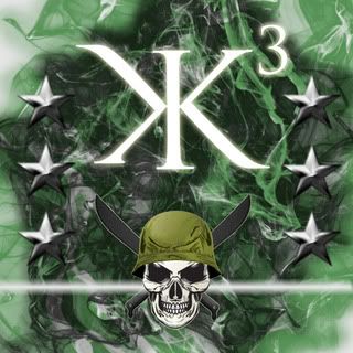
This is the last one i'm gonna make. All I gotta say is, I think it's the best one i've made.
I like it. I put it as my desktop background
Hope you guys like it
")
Thats a good one Manuel even though I don't like the green myself... It's outdated and I would prefer blue.
I think we should also have KKK and not K3in it since that's what the tags say.
I can only give tips and not make a banner myself as I have the worst photoshop skills.
If you'd like a banner made with paint, don't hesitate to ask
I think we should also have KKK and not K3in it since that's what the tags say.
I can only give tips and not make a banner myself as I have the worst photoshop skills.
If you'd like a banner made with paint, don't hesitate to ask

If you'd like a banner made with paint, don't hesitate to ask
Don't hesitate to ask me either.
I've already made a draft...

:troll2:

I made this in a few minutes. I kinda like it lol
I agree with the D!
oh by the way WaLLy, when my mom was taking web design last semester she had asked me to make some favicons/banners. She had a max of 64x64 for the favicon which looked pretty nice. Just a suggestion because favicons don't really have to be much bigger.
:dont_know: idk what to do then.. sorry. i tried.
If you're going to go with a banner like NIcks, this thread was pointless. It's basically the same thing. I think the current one looks better. No offense.
I'm not my call. Just how the current banner is in place, it was put in a vote and that's what we went with. You should know I rarely do much without some sort of approval from the masses. Besides, I usually get lynched if I do something without some backing

Just to clarify, all (if there aren't many) submissions will be put in a poll so the top vote getter gets the cake.
edit:
and to keep going with my opinion, I prefer our current banner to what's been submitted thus far.